How to Create a Cropper Component in Vue Using TypeScript and vue-advanced-cropper
Developing web/mobile applications, from the server-side to the client-side. With 6 years of experience in software development. I am skilled in using a range of data mining language and technologies working as Big Data Engineer for 4 years.
Using a pre-defined cropper such as Vue-advanced-cropper can save you a lot of time, but using it properly as a reusable component is not always easy to implement. In this tutorial, you will learn how to create a cropper component in Vue using TypeScript and the vue-advanced-cropper library.
Getting Started
First, you need to install the Vue-advanced-cropper library. You can do this by running the following command in your terminal:
npm install vue-advanced-cropper
Once the library is installed, is time to create our reusable component. You can do this by creating a new file called BaseCropper.vue
The code
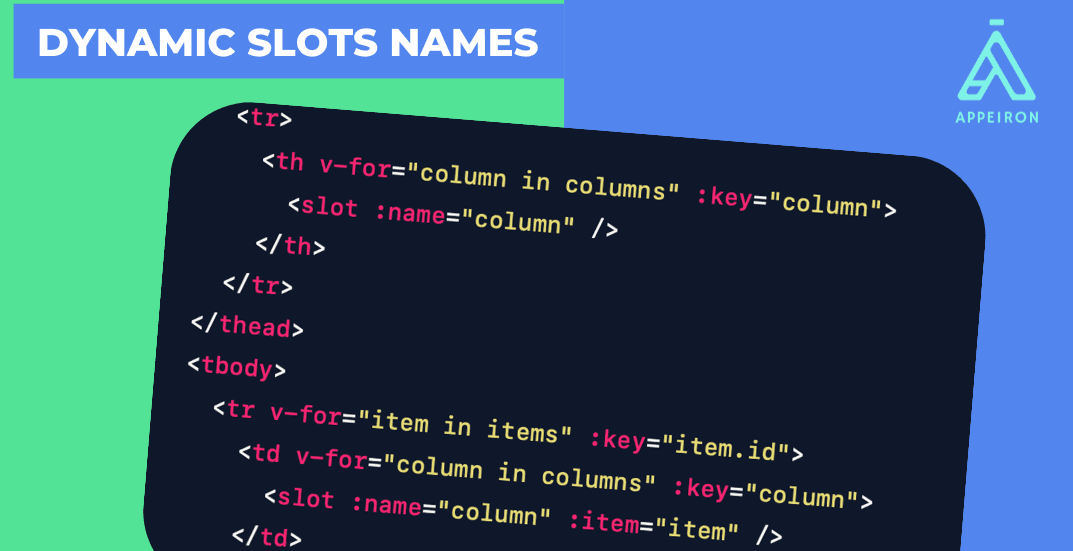
The following code shows the basic structure of the BaseCropper.vue component:
<script lang="ts" setup>
import { Cropper } from 'vue-advanced-cropper'
import 'vue-advanced-cropper/dist/style.css'
import { ref, watch } from 'vue'
defineProps({
  imageSource: {
    type: String,
    required: true,
  },
  imageSize: {
    type: Object,
  },
})
const imageRef = ref('parentImageRef')
const emit = defineEmits(['onImageChange', 'onCrop', 'onCancel'])
watch(imageRef, () => {
  emit('onImageChange', imageRef.value)
})
</script>

<template>
  <div>
    <Cropper
      ref="imageRef"
      :src="imageSource"
      :stencil-size="imageSize"
      :stencil-props="{
        handlers: {},
        movable: false,
        resizable: false,
      }"
      image-restriction="stencil"
    />
    <hr class="solid" >
    <div>
      <button @click="$emit('onCancel')">Cancel</button>
      <button @click="$emit('onCrop')">Crop image</button>
    </div>
  </div>
</template>

<style>
.cropper {
  min-height: 300px;
  width: 100%;
}
hr.solid {
  border-top: 3px solid #bbb;
}
</style>
The template for the Cropper component is simple. It simply renders the Cropper component with the imageSource and imageSize props. It also renders a hr element and two buttons. The first button is used to cancel the crop, and the second button is used to crop the image.
Piece by piece
Now will let's explain the complete code piece by piece
<script lang="ts" setup>
import { Cropper } from 'vue-advanced-cropper'
import 'vue-advanced-cropper/dist/style.css'
import { ref, watch } from 'vue'

// Define the props
defineProps({
  imageSource: {
    type: String,
    required: true,
  },
  imageSize: {
    type: Object,
  },
})

// Create a ref to the image
const imageRef = ref('parentImageRef')

// Define the emits
const emit = defineEmits(['onImageChange', 'onCrop', 'onCancel'])

// Watch the imageRef and emit the onImageChange event when it changes
watch(imageRef, () => {
  emit('onImageChange', imageRef.value)
})
</script>
The first part of the code imports the Cropper component from the vue-advanced-cropper library. It also imports the CSS styles for the Cropper component. Then, it defines the props for the Cropper component. There are just two props that I consider necessary in my component but there are a lot of possible props, you can explore the library API to define those you could add.
The imageSource prop is required and is the URL of the image that you want to crop. The imageSize prop is an object that specifies the width and height of the image.
Next, the code creates a ref to the image. This ref will be used to access the image in the template. Then, let's define the emits for the Cropper component.
The onImageChange event is emitted when the image changes (This will be used by the parent component to update its ref). The onCrop event is emitted when the crop is complete, and the onCancel event is emitted when the user cancels the crop.
Finally, the code watches the image and emits the onImageChange event when it changes. This ensures that the image is always up-to-date.
<template>
  <div>
    <Cropper
      ref="imageRef"
      :src="imageSource"
      :stencil-size="imageSize"
      :stencil-props="{
        handlers: {},
        movable: false,
        resizable: false,
      }"
      image-restriction="stencil"
    />
    <hr class="solid" >
    <div>
      <button @click="$emit('onCancel')">Cancel</button>
      <button @click="$emit('onCrop')">Crop image</button>
    </div>
  </div>
</template>
<style>
.cropper {
  min-height: 300px;
  width: 100%;
}
hr.solid {
  border-top: 3px solid #bbb;
}
</style>
The CSS styles for the Cropper component are very simple. They simply set the min-height and width of the Cropper component to 300px and 100%, respectively.
Using the component
Once the component is created, we can use it.
In this example, I'm using it in a custom dialog component after a file was selected
<BaseDialog v-model="coverDialog">
    <ImageCropper
        :image-source="coverPicked"
        :image-size="{
            width: 500,
            height: 200,
        }"
        @on-crop="cropCoverImage"
        @on-cancel="closeCoverDialog"
        @on-image-change="updateCoverRef"
    />
</BaseDialog>
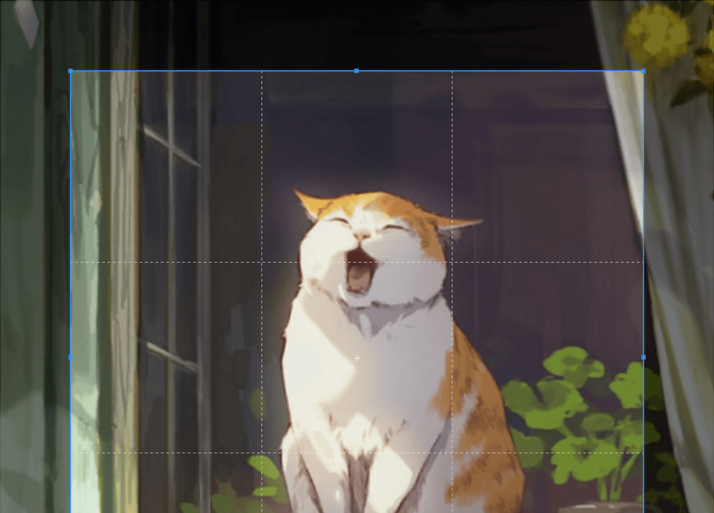
And the result is:

Conclusion
This is a basic example of how to create a Cropper Vue component using TypeScript and Vue-advanced-cropper. You can use this code as a starting point to create your own Cropper component.